[Orig to FB]
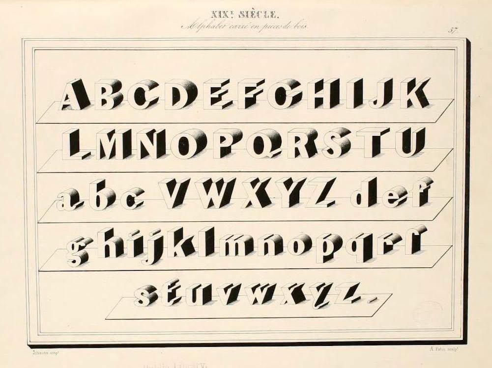
Public Domain Review: “An ‘alphabet album,’ a beautiful book of calligraphy and typographic engraving from 1843 assembled by Joseph-Balthazar Silvestre. Ranging from the old-fashioned to the surprisingly modern looking, from the elegantly unreadable to the crystal clear.
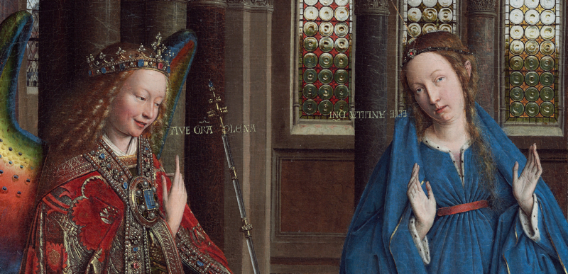
I wish I could tag Joshua Darden on this. Looking at this, it occurred to me that there’s a whole history to be found in which direction this kind of dimensional typography is extruded in. Are we looking down on it (as this example) or up at it? Is it trailing away to the left or right? Is it deep or shallow? Does it cast a shadow on another surface or is it floating? Are the dimensional extrusions straight or curved, like the presentation type for Superman? If you could vacuum up every example from the last few centuries and wrap them in a bit of metadata — basically, “history, form, and use” and someone I knew once put it — you’d have some very fertile soil for a speculative history. I say speculative because the data would be so thin, the role of arbitrary aesthetics so central, and the effect of trends (like superhero comics) would be so strong that there wouldn’t be any way to ‘prove’ some neatly reductive thesis. BUT: all of those factors would be prominent because the broad context would be secular modernity. And that matters because we have a few vast and meticulously documented control groups. The most important one is the entire history of lettering in religious texts — illuminations, initials, and all the rest. And while that entire field marks a millennium-long high point of utterly fantastic ‘ludic‘ history, you can be sure that ‘stylistic’ questions of the kind I’m asking would have been seen as having serious theological significance. (Just one concrete example: Jan Van Eyk’s Annunciation in NYC’s Met, in which the angel Gabriel’s message is placed ‘forward’ in space but Mary’s response is ‘backwards’![!!] 😹) And, indeed, there’s another control group as well: classical monumental inscriptions from a society — many, really — where religion was pluralistic, so there would be no need to attribute some ridiculous theological implication to how an artist positioned their perspective on words. I had some other thought about this, but it escapes me now. Worth revisiting, though, as one of those non-projects I’d get to if I had more discipline. Then again, if I did I wouldn’t have thought of this, let alone written it down. 😜
[Other people I can’t tag who’ll get this: Marina LaPalma, for Rich’s distinction between inscriptive and bibliographical cultures in The Plenitudes. Beth McGroarty, because this cross-cuts countless conversations we’ve had. Korinna Patelis, who more than almost anyone I know lives this kind of lunatic meta-mastery of disciplinarity on every level. Kristen Vallow, who doesn’t know but should that she’s always been one of my intellectual and aesthetic heroes. Women, all — and it’s not an accident.]